Improving conversion rates is one of the most important things that you can do for your website. A conversion rate optimization strategy will help generate more revenue and ultimately grow your business.
First things first: Your website needs a goal
When I examine websites, I ask individuals about their most important business objective — the action they want visitors to accomplish on their site.
No, I’m not kidding. What makes one website better than another? It’s all about how well the website meets a goal. There is no way to improve a site that does not have a goal. You can only enhance what you can measure.
Some clients tell me that their goal is for visitors to “read about their goods.” That isn’t a goal. The action of signing up, purchasing, clicking on anything, or ordering something are all good goals to pursue.
You must have a new goal if your only aim is for visitors to read the content on your website.
Here are 10 tips to increase conversions on your website today!

#1. Do A/B testing
Split testing (or A/B testing) is a method for increasing your website’s conversion rate (that is, the number of people that become customers or take a specified action).
If you’re stumped by which to choose between two possible headlines for your page, you could conduct an A/B split test to determine which one performs better.
In this example, A/B testing software directs half of your traffic to page A and the other half to page B. Both pages have a call to action, and you count how many individuals take the action to determine which headline performed best.
Examples of things you can test:
- The headline: According to copyblogger, eight out of 10 people will read headline copy, but only two out of 10 will read the rest.
- The offer. What is it that the customer receives for their money (how is it all described and organized)?
- Page layout and navigation.
- Different media: consider adding a video to illustrate important points.
- Change on a grand scale. You may wish to compare two completely different pages.
#2. Add trust factors to your website
Create trust signals to show your visitors that you are reputable and safe.
There are only 4 reasons why people won’t buy from you:
- no need
- no money
- not in a hurry
- no trust.
We can’t do much with the first three seasons, but we have control over the trust aspect.
Add trust-building components such as reviews, security badges, third-party accreditation logos, etc. to your website in order to build trust and increase your conversion rate.
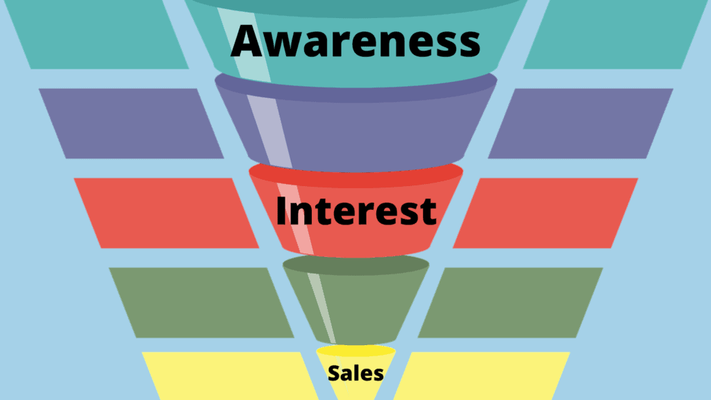
#3. Set up a sales funnel

A good sales funnel is critical to conversion rates.
It’s a multi-step, intentional path that you take your visitors on from their first point of contact with your brand through the final action they take before becoming customers.
The simpler the funnel, the fewer conversion issues you’ll have. It’s much better to make things as simple and easy for your customers as possible.
Think about an actual sales funnel: it starts at one end with lots of people who are interested in what you’re offering then filters out those that aren’t ready or able to buy.
Remember, people need time to consider purchases before they’re ready to commit. The more expensive or sophisticated the product, the more time individuals require in order to make a decision.
#4. Address Objections
According to Michael Aagard, who wrote an excellent post about conversion rate optimization, “Objections are reasons why you don’t buy which might be either real or imagined; it’s how people feel rather than what they think that drives their final decision.”
Below are some common objections that you should address in your sales copy in order to improve conversions:
- You don’t seem to comprehend my situation (explain the issues your product solves).
- Why should I trust you? (show your credentials, expertise, accolades, and so on)
- What if it doesn’t work for me? (have testimonials from a variety of users who have benefited from your product)
- It’s not worth the money; there are more cost-effective options available (explain your price, compare it to the competition, and demonstrate why your product is better than anything out there)
It’s critical to come up with as long a list as possible. Get feedback from the outside world, conduct user testing, and ask your consumers what they’re concerned about.
#5. Remove Distractions
Nobody likes to be distracted when they’re trying to accomplish a task.
Use a simple, straightforward layout with no distracting or confusing elements. If it’s not necessary, don’t include it. Stick to just what your visitors need to know and nothing more.
When possible, implement the following (and not much else):
- Headline and subheadings
- Benefits and features
- Client testimonials and/or reviews
- Call to action
There are a few more factors to think about — such as a live chat box, social proof, and video – but the message is the same: eliminate all distractions. You want your visitors to pay attention only to your offer.
#6. Make it easy to buy from you

Create a one-click purchase option.
A simple, single click is much easier for people to make than filling out an entire form or making several clicks over the course of minutes (or even hours).
This conversion tip can be applied in many different ways: use PayPal buttons with pre-populated information; create links that send visitors directly to your shopping cart page; offer auto-delivery options so customers don’t have to reorder every time they run low on product. These are just some examples — you’re only limited by your imagination and creativity!
The more difficult it is for people to buy from you, the less likely they’ll complete their order. So do everything possible to streamline and simplify the purchasing process.
#7. Offer proof
We live in a world of false advertising and deceptive claims, so people will naturally assume the worst when they come across your pitch.
You need to counter those suspicions with proof – testimonials, user research results, case studies, awards/accolades — anything that will prove what you’re saying about your product or service is accurate.
The more evidence you can offer for why someone should buy from you, the better! After all: “Actions speak louder than words.”
#8. Reduce or remove risk
People are risk-averse. They don’t want to take chances unless they’re guaranteed a specific outcome – and conversion rates are no different.
You need to remove as much uncertainty from the equation as possible, even if it means you have to offer guarantees or refunds (although these should be used carefully).
Here are some examples of great guarantees:
- Hyundai and America’s Best Warranty. Hyundai had a long history of producing vehicles that regularly break down. As a result, they started offering a ten-year warranty – essentially stating that since they’re offering such a lengthy guarantee, it can’t be considered an awful vehicle.
- The Punctual Technician. Comcast techs were renowned for being late. To combat this prejudice, and prove how serious they were about improving, Comcast promised its clients that if a technician doesn’t arrive on time for an appointment, they would automatically credit the customer $20.
- Price Match Guarantee. Simple but effective, Best Buy price matches all local retail competitors (including their online prices) and we price products shipped from and sold by their major online competitors: Amazon.com, Crutchfield.com, Dell.com, HP.com, and TigerDirect.com.
#9. Improve your page speed
When it comes to website conversions, a huge obstacle is page speed. This is the time it takes for your content to appear on the screen.
People get frustrated when they have to wait too long for a page load – Did you know that 40% of people abandon sites that take more than 3 seconds to load?
You should do everything possible to keep your site running fast. If your landing page isn’t converting well, analyze your page speed with Google’s PageSpeed tools.
The Google PageSpeed tool will give you an idea of what needs to be optimized on your landing page in order to increase its load time.
This can get a bit technical and the truth is: “Time kills deals.” So don’t let it kill yours before its time! If you want conversion rate optimization done right then contact Unique Web Designer today.
#10. Optimize for mobile

Mobile conversion rates are still relatively low when compared to desktop.
However, mobile is the future – and you need to be prepared for it now if you want to reach consumers in their own environment.
Did you know that 60% of all searches come from mobile devices? And 61% of people who search on mobile end up buying or visiting a store within 24 hours?
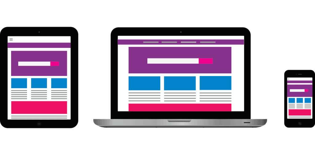
You should optimize your site/landing page for mobile devices by using responsive design (which means that no matter what device someone uses to access your content, they’ll get an optimized version) at the very least!
To learn more about conversion rate and mobile optimization visit Unique Web Designer today! We know all about CRO 🙂.
Conclusion:
There are a lot of factors that go into increasing conversions, and we’ve covered some of the most important ones in this blog post.
We hope you found these tips useful and will be able to use them for your own website or marketing campaigns!
If you’re having trouble implementing any of the recommendations outlined above, please don’t hesitate to contact us.
Do any of these 10 tips resonate with you? Which one is top on your list to implement first? Let us know so we can keep talking about what works best for your business!

