Every conversion-rate optimizer knows that landing pages are the backbone of any successful advertising campaign. But what makes a high-converting landing page?
In this post, I’ll discuss how to create user-friendly landing pages in order to improve conversions. However, before we get into it, let’s define the word “conversion.”
What is a Conversion?
My definition of a conversion is when a visitor to your website takes the action that you want.
This action could be filling out a form, signing up for your newsletter, or making a purchase.
The percentage of total visitors that result in a conversion is known as your conversion rate.
What is a Landing Page?
I have spoken with many people in the web design industry over the years and it seems that most have their own definition of what a landing page is.
The simplest definition of a landing page is simply a page on your website that you usher people to.
This could be from social media ad campaigns, blog posts, other pages on your website, PPC ads, etc.
The one misconception that I see many people have is that they consider a website’s home page as the only landing page on a site.
While the home page of a website is by definition a landing page, you can have as many landing pages as you want on your site.
Most businesses actually create specific landing pages to test how well their marketing campaigns are performing which is something that you cannot do if you point everybody to your home page.
So, what makes a high-converting landing page?
A great landing page has seven essential elements that assist in converting visitors into leads or clients.
#1. Speed
You’re probably surprised to find “speed” as the number one essential element of a high-converting landing page.
However, consider the following:

What’s the point of creating a landing page that most people trying to reach it will never see because it takes too long to load?
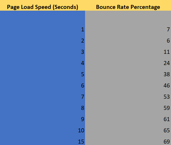
You should not spend money testing a landing page that takes over five seconds to load because you will lose at least 38% of your investment on bounce rate alone.
How can you test the load speed of your landing page?
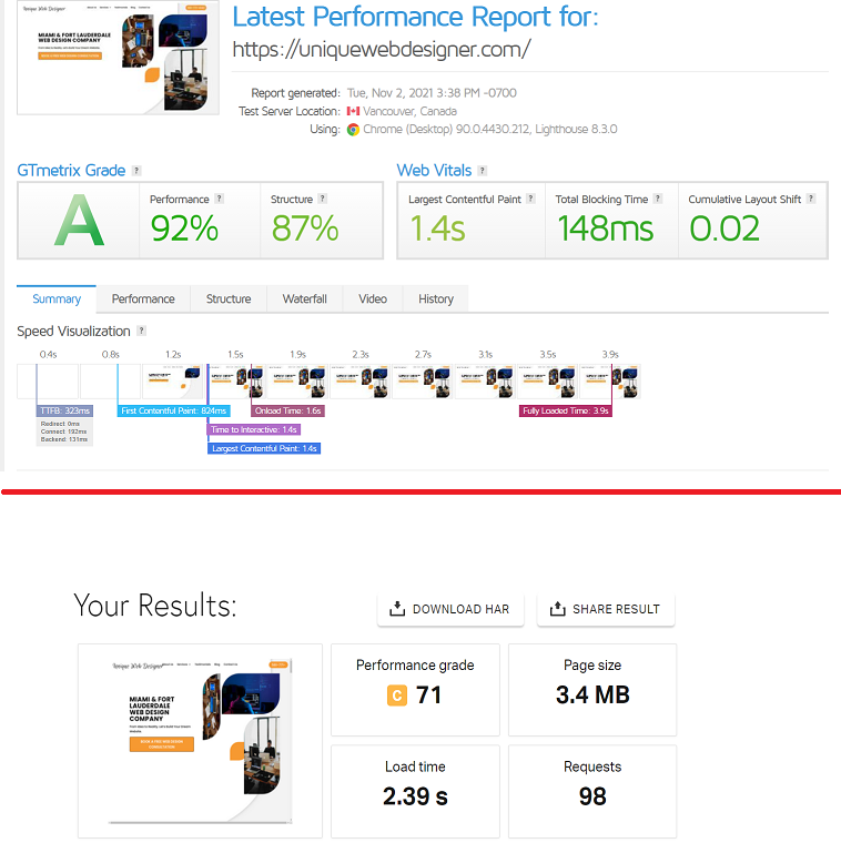
Enter the specific URL of your landing page into either site and see the results.
Both will provide you with the load speed of your website and give you pointers on how you can improve it.

I recommend that you run these tests at different times of the day to get an accurate load speed range for your landing page.
The reason for this is that as you can see from the tests above my website shows different load speeds but if I run several more tests I should get a solid range and know if I need to improve my load speed or not.
Side note: Load speed can be affected by things that are completely out of your control such as server configuration, web traffic, and hosting provider.
That’s why it’s important to run several tests throughout the day so that you are certain your first test result is not an outlier.
#2. Clear Message
Your high-converting landing page needs to have a clear message that is concise and easy for the visitor to understand.
The moment a visitor lands on your landing page they should know exactly what you want them to do next.
Your header should answer one question and one question only:
What problems can you solve for me?
In order for your message to be effective, it must align with where your visitor came from.
If you clicked on a Facebook ad because you are interested in private golf lessons and are taken to a page selling gulf clubs you’re probably going to leave immediately.
There is a correlation between private golf lessons and golf clubs, but you are looking to find a golf coach, not to buy new golf clubs.
Make sure all of your landing pages have one clear message and everything on the page should complement that message and nothing else.
#3. Social Proof
If you’ve ever purchased anything online (and especially if it was pricey), you’ve undoubtedly looked for product reviews.
That’s social proof, and it’s one of the most powerful tools of persuasion.
Simply put, social proof is the use of social signals to demonstrate that others have purchased, consumed, read, or engaged with what you’re offering.
The idea is that people are more inclined to convert if they can see that others have (and were satisfied) before them.
And the numbers don’t lie. BrightLocal found that the average consumer reads 10 reviews before being able to trust a business.
In other words, if your landing page doesn’t provide the right social cues, your visitors may bounce and look elsewhere regardless of how good your offering is.
Below are samples of social proofs you can use on your landing page:
- Customer reviews
- Expert or influencer testimonials
- Awards received from well-known organizations
- Mentions in highly regarded publications
- Trust seals to show that your landing page is secure
#4. Call to Action (CTA)
The most essential element of your landing page is the call-to-action (CTA).
The purpose goal of your landing is to create a conversion. Your call to action is the way to create that conversion.
A high-converting landing page should have one value proposition, one clear message, and one dominant CTA above the fold.
I cannot stress enough the importance of your CTA showing above the fold. This means that anyone arriving on your landing page should be able to clearly see your CTA without having to scroll down the page.
The most effective landing page CTAs are unmissable but do not take away from your message.
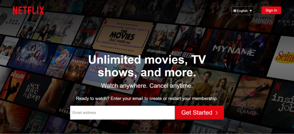
Here’s are a good example from Netflix:
It doesn’t get much better than that.
Upon landing on that page you know exactly what Netflix offers and their CTA clearly communicates what action they want you to take.
#5. Features and Benefits
A compelling headline and clear CTA should grab your visitor’s attention, while the features and benefits sections provide additional details and answer any remaining queries about your proposition.
When introducing your features, it’s essential to emphasize the benefits they deliver and how they help solve a problem.
Remember that your product or service’s features describe what it does, whereas your benefits explain its value.
Put yourself in your visitor’s shoes and ask, “How will this product or service benefit me?” before listing your features.
Keep things simple. Write a brief summary of each feature and focus on the value they provide.
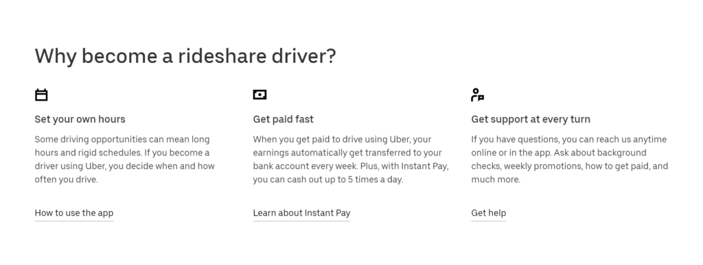
Here’s a good example:
Uber does a great job of focusing on the value that their most popular features provide to potential drivers.
#6. Remove Distractions
This is the easiest point to get across.
The point of your landing page is to get your visitors to take a specific action.
Anything that distracts them from taking said action should be removed if you want a high-converting landing page.
Here’s a list of common landing page distractions:
- Overly complicated navigation menu – It’s better not to have one.
- Pop-ups promoting other products or services.
- Too much verbiage – be precise and get right to the point.
- Animations – They are nice but if not used properly can be a major distraction to your visitors.
#7. Proper Tracking
The goal of your landing page is to make its visitors take a specific action.
The point at which that action is taken is known as a conversion.
So how can you know if your landing page is converting at an acceptable rate?
The only way is by setting up proper tracking.
You should be able to tell where your visitors are coming from and how many of them are converting.
Having this information will shed light on what your best performing landing pages are and which referring method is working best.
There are many reputable conversion rate tracking software companies out there, but I always recommend my clients use Google Analytics.
It’s easy to understand, a breeze to set up, and you can set up conversion goals to track the progress of your landing pages.
What About Landing Page Design?
If you’re not experienced in creating landing pages, working with a professional web design company is a must.
A good web design company will be able to create a landing page to display your products and services in the best light while staying on point with your brand.
Here are some additional articles that could help you in creating a high-converting landing page:
- 11 Places To Get Free WordPress Support For Your Website
- Template vs Custom Website Design: What’s the Difference?
- 7 Tips for Finding a Good Web Design Company in Miami
Conclusion
Having a high-converting landing page can do your pockets a whole lot of good.
A properly laid out landing page can greatly increase your conversions which ensures more money in your pockets.
That’s why you must make sure your landing page has a clear message, an unmissable call to action, and zero distractions.
Be as precise as possible and follow proper web design guidelines to keep your conversion rates are on the up and up.


