
Choosing a color scheme for your website is an important aspect of web design. The colors you choose will impact the overall look and feel of your website, and can even affect how users perceive your brand. With so many colors and combinations to choose from, it can be overwhelming to decide on a color scheme that will work well for your website. In this article, we’ll guide you through the process of choosing good website color schemes.
Table of Contents
Understanding Color Theory
Types of Color Schemes
Factors to Consider When Choosing Colors
Using Color Psychology
Testing Your Color Scheme
Additional Considerations for Choosing Website Color Schemes
Examples of Good Website Color Schemes
Conclusion
Tools to Help You Choose a Website Color Scheme
Understanding Color Theory
Before diving into the specifics of choosing colors for your website, it’s important to understand the basics of color theory. Color theory is the study of how colors can be combined and used in design to create a desired effect. Understanding color theory can help you make informed decisions when choosing colors for your website.
There are three primary colors: red, blue, and yellow. These colors cannot be created by mixing other colors together. Secondary colors are created by mixing two primary colors together. For example, mixing blue and yellow creates green. Tertiary colors are created by mixing a primary color with a secondary color. For example, mixing red and orange creates red-orange.
Color theory also includes the concept of color harmony, which refers to the way colors are combined to create a pleasing visual effect. There are several color harmony techniques that designers use to create effective color schemes.
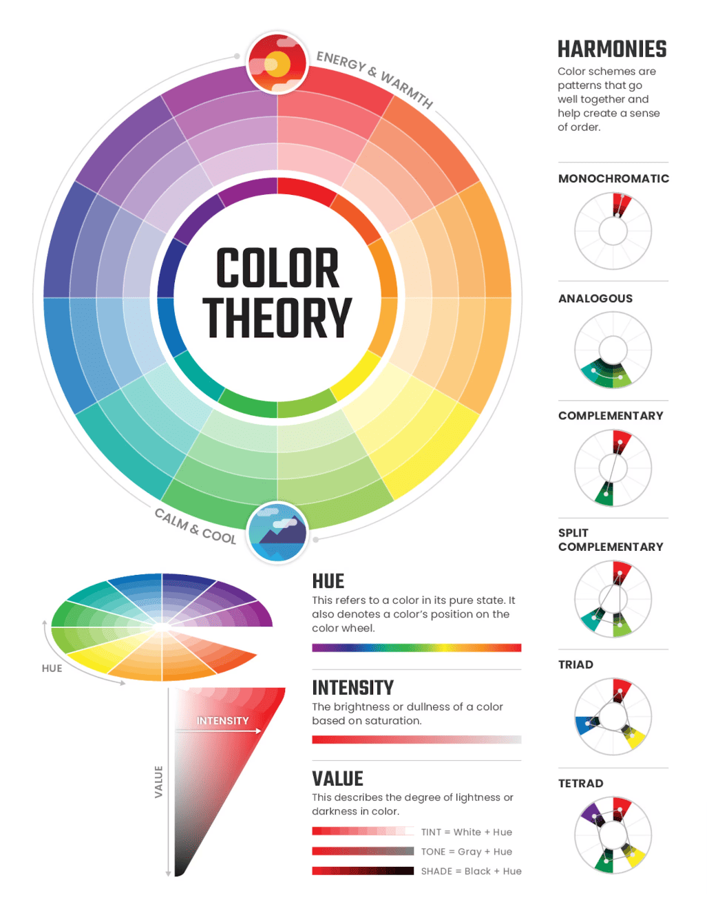
Image courtesy of pavilion.dinfos.edu/
Types of Color Schemes
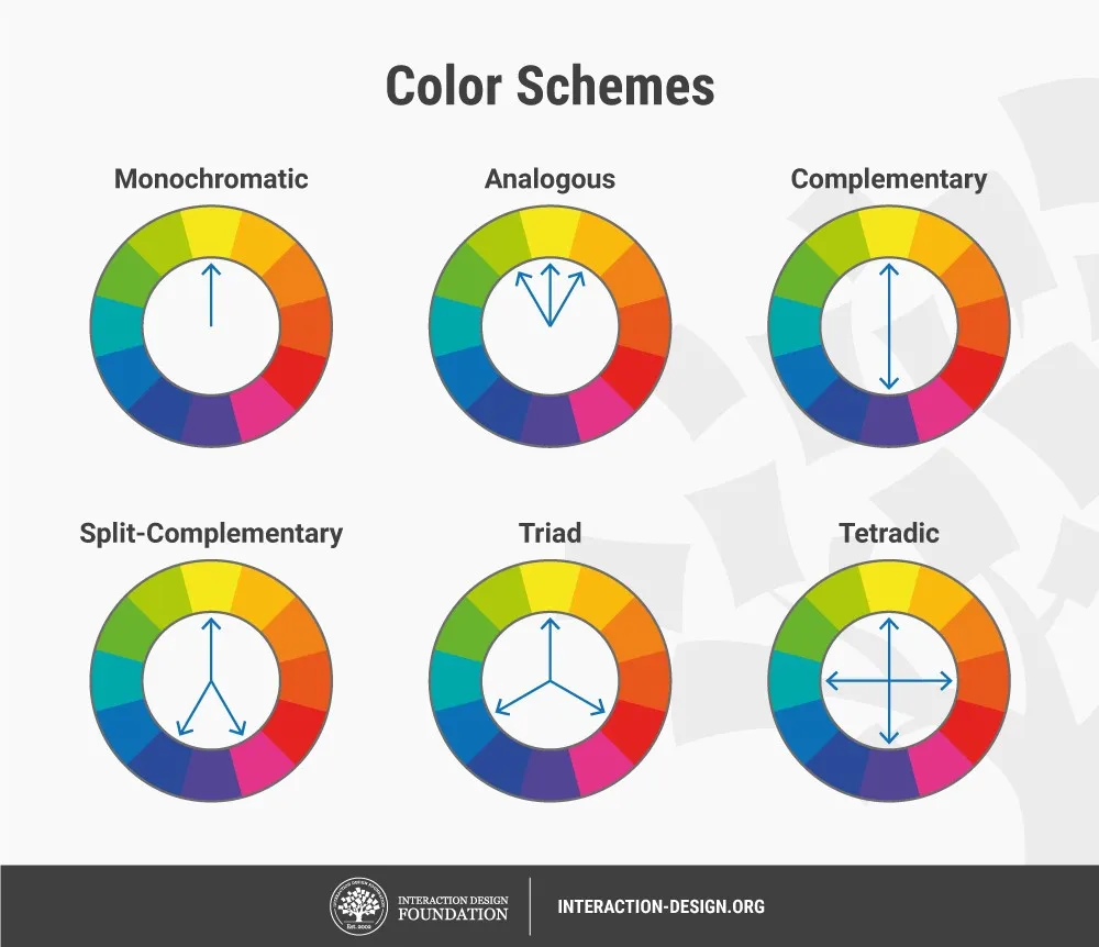
There are several types of color schemes that you can use for your website. Each type of color scheme has a different effect on the overall look and feel of your website. Some common types of color schemes include:
- Monochromatic: A monochromatic color scheme uses different shades and tints of a single color. This type of color scheme is easy to create and can create a calming and cohesive look.
- Analogous: An analogous color scheme uses colors that are next to each other on the color wheel. This type of color scheme can create a harmonious and natural look.
- Complementary: A complementary color scheme uses colors that are opposite each other on the color wheel. This type of color scheme can create a bold and eye-catching look.
- Triadic: A triadic color scheme uses three colors that are evenly spaced on the color wheel. This type of color scheme can create a vibrant and energetic look.
- Tetradic: A tetradic color scheme uses four colors that are arranged into two complementary pairs. This type of color scheme can create a dynamic and balanced look.
Factors to Consider When Choosing Colors
When choosing colors for your website, there are several factors to consider. These factors can help you create a color scheme that is appropriate for your brand and appeals to your target audience.
- Branding: Your color scheme should be consistent with your branding. If you already have a logo or established brand colors, you should use those colors as a starting point for your website color scheme.
- Industry: The industry you’re in can also influence your color choices. For example, a law firm may want to use more traditional colors like navy blue and burgundy, while a children’s toy company may want to use bright and playful colors.
- Target Audience: Your target audience can also influence your color choices. If you’re targeting an older demographic, you may want to use more muted colors. If you’re targeting a younger demographic, you may want to use brighter and more vibrant colors.
- Contrast: Contrast is important for readability and accessibility. You should choose colors that provide enough contrast between text and background to make your content easy to read.
- Emotion: Colors can evoke different emotions and feelings. For example, blue can create a feeling of trust and security, while red can create a feeling of excitement and urgency. Consider the emotions you want to evoke when choosing your color
When choosing colors for your website, you need to consider how you’ll be using them for different elements. Each element of your website can be colored differently, and it’s important to consider how those colors will work together to create a cohesive look.
- Background: The background color of your website is the foundation for your entire color scheme. It should be a neutral color that complements your branding and allows your other colors to stand out.
- Text: The text color of your website should provide enough contrast with the background to make your content readable. It’s also important to consider the font you’ll be using, as some fonts are more legible than others.
- Buttons: Buttons are an important call-to-action element on your website. The color of your buttons should stand out from the rest of your website and create a sense of urgency or importance.
- Navigation: Your website’s navigation should be easy to find and use. The color of your navigation should be distinct from the rest of your website and should make it clear where users should click to find what they’re looking for.
- Accent Colors: Accent colors are used to draw attention to important elements on your website, such as headlines or links. They should complement your other colors and add visual interest to your website.
Infographic courtesy of LogoGarden
Using Color Psychology
Color psychology is the study of how colors affect human behavior and emotions. When choosing colors for your website, it’s important to consider how they might affect your users.
- Red: Red is a bold and attention-grabbing color that can create a sense of urgency or excitement. It’s often used for call-to-action elements like buttons.
- Orange: Orange is a friendly and energetic color that can create a feeling of warmth and enthusiasm. It’s often used for accent colors and in industries related to food or leisure.
- Yellow: Yellow is a bright and cheerful color that can create a feeling of happiness and optimism. It’s often used for accent colors and in industries related to children or creativity.
- Green: Green is a calming and refreshing color that can create a feeling of balance and harmony. It’s often used in industries related to nature or health.
- Blue: Blue is a trustworthy and calming color that can create a feeling of security and stability. It’s often used in industries related to finance or technology.
- Purple: Purple is a creative and luxurious color that can create a feeling of sophistication and elegance. It’s often used in industries related to beauty or fashion.
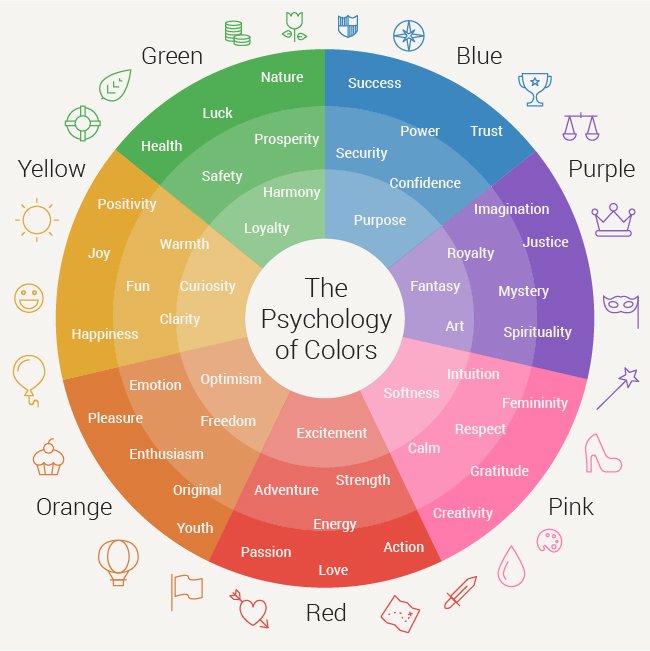
Source: Pinterest
Testing Your Color Scheme
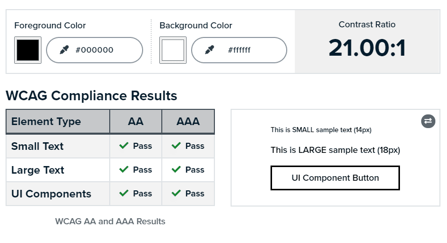
Once you’ve chosen a color scheme for your website, it’s important to test it to make sure it’s effective. You can use online tools to test your color scheme for accessibility and readability.
- Color Contrast Checker: This tool allows you to check the contrast between your text and background colors to make sure they meet accessibility guidelines.
- Color Blindness Simulator: This tool allows you to see how your color scheme looks to users with different types of color blindness.
- Browser Compatibility Checker: This tool allows you to see how your color scheme looks on different browsers and devices.
Additional Considerations for Choosing Website Color Schemes
In addition to the factors already mentioned, there are several other considerations that can help you choose a good color scheme for your website.
Your Branding: Your website should be an extension of your brand, and your color scheme should reflect that. Look at your company’s logo, brand messaging, and other marketing materials to get an idea of the colors that already represent your brand. Use those colors as a starting point for your website color scheme.
Your Industry: Different industries tend to use different colors in their branding and marketing materials. For example, the healthcare industry often uses blues and greens to convey a sense of trust and calm, while the food industry often uses warm colors like red and orange to stimulate appetite. Research the colors commonly used in your industry and consider using those in your website color scheme.
Your Target Audience: The age, gender, and interests of your target audience can also play a role in your color choices. For example, bright, bold colors might be more appealing to a younger audience, while softer, more muted colors might appeal to an older audience. Think about the demographics of your target audience and how they might respond to different colors.
Contrast and Readability: The contrast between your text and background colors is important for readability. It’s also important to choose colors that are easy on the eyes and don’t strain your users’ vision. Use high-contrast colors for text and background to ensure that your content is readable and accessible to all users.
Emotion and Mood: Colors can also evoke different emotions and moods in your users. For example, blue can create a feeling of calmness and trust, while red can create a feeling of excitement and urgency. Think about the emotional response you want to elicit from your users and choose colors accordingly.
Accessibility: Accessibility should always be a consideration when choosing website colors. People with color blindness or visual impairments may have difficulty distinguishing between certain colors. Make sure your color scheme is accessible by using high-contrast colors and providing alternative text for images.
Consistency: Consistency is key to creating a cohesive website color scheme. Choose a primary color and one or two accent colors and use them consistently throughout your website. This will create a sense of visual unity and make your website look more professional.
Examples of Good Website Color Schemes
Here are some examples of effective website color schemes to inspire your own color choices:
- Black and white: A classic color scheme that is always in style. This simple color combination is elegant and sophisticated and can be used in a variety of industries.
- Blue and orange: This color combination is bold and energetic and is often used in industries related to sports and fitness.
- Green and yellow: This combination of fresh, natural colors is perfect for websites related to health and wellness.
- Pink and purple: This color combination is playful and feminine and is often used in industries related to beauty and fashion.
- Red and black: This bold color combination is often used in industries related to luxury and sophistication.
- Yellow and gray: This subtle color combination is modern and sophisticated and can be used in a variety of industries.
Conclusion
Choosing a good website color scheme is a crucial part of web design. Your color scheme can have a significant impact on the overall look and feel of your website, as well as the emotional response it elicits from your users. By considering factors like branding, industry, target audience, contrast, and emotion, you can choose a color scheme that is both visually appealing and effective in conveying your brand and message to your audience. Remember to test your color scheme for accessibility and readability, and use online tools to make sure it looks great on all devices and browsers. With a little planning and attention to detail, you can create a website color scheme that enhances your brand and engages your users.
Remember, your website color scheme is just one aspect of your overall web design. It should work in harmony with your typography, imagery, and layout to create a cohesive and effective user experience. Take the time to explore different color combinations and consider the impact they will have on your users. By following the guidelines and suggestions outlined in this article, you can choose a color scheme that represents your brand, appeals to your target audience, and enhances your website design.
Tools to Help You Choose a Website Color Scheme
Choosing a website color scheme can be a daunting task, but there are many tools and resources available to help you. Here are some of the best tools to help you choose a website color scheme:
- Adobe Color: This online tool allows you to create custom color schemes based on color rules or images. You can save and share your color schemes and even explore color schemes created by other users.
- Canva Color Palette Generator: This free tool allows you to upload an image and create a color palette based on the colors in the image. You can also use the tool to create custom color palettes and download them for use in your design.
- Coolors: This online tool allows you to generate color schemes based on color rules or by using a color wheel. You can save and share your color schemes and even integrate them into design programs like Adobe Photoshop and Illustrator.
- Color Hunt: This website offers a collection of color palettes created by designers from around the world. You can browse and search the collection for inspiration or create your own color palette using the tool.
- Colorzilla: This browser extension allows you to sample colors from any website and create custom color palettes. You can also use the tool to adjust the brightness and saturation of colors.
By using these tools and resources, you can create a color scheme that is both visually appealing and effective in conveying your brand and message to your users.
Finally, choosing a website color scheme is an important part of web design. Your color scheme can have a significant impact on the overall look and feel of your website, as well as the emotional response it elicits from your users. By considering factors like branding, industry, target audience, contrast, and emotion, you can choose a color scheme that is both visually appealing and effective in conveying your brand and message to your audience. Remember to test your color scheme for accessibility and readability, and use online tools to make sure it looks great on all devices and browsers. With a little planning and attention to detail, you can create a website color scheme that enhances your brand and engages your users.
