
Hello everyone! It’s your pal Miguel back again to have an in-depth chat about an important topic for anyone with a website – responsive web design.
Now I know tech jargon can make your eyes glaze over. But responsive design is something every business owner must understand in plain English!
It’s absolutely critical for delivering great user experiences and driving success in 2023 and beyond.
In this comprehensive guide, we’ll cover:
- The history and evolution of Responsive Web Design
- What responsive design means
- Examples of responsive vs. non-responsive sites
- Big benefits for your business and impressive stats
- 20+ actionable tips for making your site responsive
- Technical considerations and development approaches
- Special considerations for eCommerce and other business types
- and more!
By the end, you’ll be a pro at understanding responsive design and optimizing your website for any device. Let’s dive in!
- The Evolution of Responsive Web Design
- What Exactly is Responsive Web Design?
- Responsive vs Non-Responsive Design Examples
- Why Your Business Needs a Responsive Website
- 20+ Quick Wins For Improving Website Responsiveness
- Technical Considerations and Techniques
- Special Considerations for E-commerce Sites
- Special Considerations for Publishers
- Special Considerations for Service Sites
- Key Takeaways on Responsive Web Design
The Evolution of Responsive Web Design
To start at the very beginning, let’s look at how responsive design developed over the years…
The desktop web
In the early days of the Internet, websites were designed primarily for desktop monitors. Fixed-width layouts were the norm, built for larger screens.
There was less concern for adapting to different devices since desktop computers were the only game in town.
The rise of mobile
As mobile phones and tablets gained popularity in the 2000s, accessing websites through smaller screens became common. But most sites were still built desktop-first.
This made the mobile experience painful, with tiny text, unusable navigation, and lots of pinching/zooming required.
A new approach emerges
By 2010, developers began exploring solutions for making websites adapt to fit all screen sizes. This became known as “responsive web design” – responding dynamically to the user’s device.
The goal was fluid and flexible sites, optimized for any screen width rather than just desktop.
Responsive design formalized
Ethan Marcotte coined the term “responsive design” in his seminal 2011 article on A List Apart. He outlined techniques like:
- Flexible layouts
- Fluid images
- Media queries to selectively style for different devices
This provided a standardized approach to building responsively.
Responsive goes mainstream
Within a few years, responsive design was widely embraced by web developers. Responsive templates and frameworks made it easy to implement.
Today responsive design is considered a fundamental best practice for web development. Non-responsive sites are increasingly rare.
It’s incredible to see how quickly responsive techniques went from bleeding edge to absolutely essential!
What Exactly is Responsive Web Design?

Now that we’ve covered a bit of history, let’s define what exactly responsive design means…
Responsive web design refers to websites that dynamically adapt and respond to different screen sizes.
Usually, this means desktop, laptop, tablet, and mobile phone screens.
A responsive site changes its layout, content, images, buttons, menus, and more automatically to optimize for the user’s current device.
For example:
- Text and buttons may increase in size for smaller mobile screens
- Menus may turn into “hamburger” icons on mobile rather than full navigation
- Sections will stack vertically instead of side by side
- Images will resize fluidly and captions may change position
- Forms and calculators will enlarge for easier use on mobile
The goal is to create smooth, seamless experiences regardless of the device being used to access your website.
Without users needing to pinch, zoom, or scroll horizontally.
It should feel like your website was custom-designed specifically for their screen size.
This differs from static, desktop-only websites that stay rigid and break on smaller mobile screens.
Through careful styling and web development, responsive sites fluidly adapt across device sizes.
Now let’s clearly visualize responsive vs. non-responsive designs…
Responsive vs Non-Responsive Design Examples
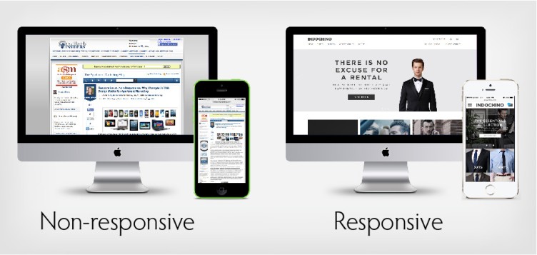
Image Courtesy of: Impress Bss
Seeing responsive sites in action makes it much clearer. Let’s look at some examples contrasting responsive and non-responsive websites:
Non-Responsive Site
- Tiny, unreadable text on mobile
- Menus unusable on small screens
- Content squished and requires zooming
- Poor mobile user experience overall
Responsive Site
- Text resizes easily readable on mobile
- Streamlined mobile menu icons
- Content stacks cleanly and enlarges
- Mobile experience feels specialized
E-commerce Non-Responsive
- Product images shrink on mobile
- Details are illegible without zooming
- Checkout flow crunched
Responsive Ecommerce
- Product images remain sized nicely
- Details stay readable
- Checkout flow optimized
Hopefully, these illustrations and descriptions make it crystal clear why responsive design is so important today! Let’s now dig into the many benefits for businesses…
Why Your Business Needs a Responsive Website
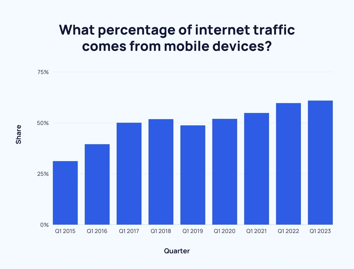
Image Courtesy of: Exploding Topics
There are so many advantages to optimizing your business website for responsiveness across devices. Here are some of the biggest benefits:
1. Google Mobile-First Indexing
Google now uses a mobile-first crawling and indexing strategy. This means they assess the mobile version of your site first to evaluate page quality and relevance for search rankings.
If your mobile experience is lackluster, it can directly hurt your search visibility and rankings. Google may label you as “not mobile friendly.”
With responsive design, Google sees the same fast, optimized content on mobile as on desktop. So your business website gets properly ranked across all devices.
2. Improved Usability and Accessibility
Responsive sites provide optimal usability and accessibility across devices. Users don’t need to pinch, zoom, or squint at tiny text on mobile.
Everything resizes fluidly based on their screen size. Critical elements like buttons, menus, text, and images adapt so they are easy to see and use on any device.
This convenience allows more users to access and enjoy your website regardless of their device.
3. Better Customer Experiences
Visiting a non-responsive site on mobile quickly frustrates users. But with responsive design, customers enjoy seamless experiences on smartphones.
And mobile traffic now makes up 61% of all website visitors in the USA! If your mobile experience disappoints, you lose business.
Responsive design shows customers you respect their needs and invest in quality experiences everywhere. You want the site to feel custom-built for every device.
4. Faster Page Speeds
Responsive design also optimizes websites for better performance across devices.
Mobile sites download faster thanks to:
- Reduced image file sizes
- Simplified page layouts
- Removal of unnecessary bloat
- Optimized code and assets
Faster load times keep visitors on your site longer. Research shows that 53% of mobile users will abandon pages slower than 3 seconds!
5. Lower Bounce Rates
Bounce rate measures how quickly people leave your website. If layouts are broken or content is hard to use on mobile, bounce rates rise.
With responsive sites providing seamless mobile experiences, visitors stay and engage longer across devices.
Lower bounce rates help your website’s reputation with Google and other traffic sources. More time on site indicates higher quality content.
6. More Social Sharing
Here’s an interesting stat – mobile visitors are twice as likely to share content on social media compared to desktop users.
With responsive sites offering easier sharing flows on mobile, you benefit from higher social engagement wherever users access your content.
Those social shares then continue driving new visitors from networks like Facebook and Twitter. Responsive design really fuels word of mouth.
7. Higher Conversion Rates
The ultimate goal for most websites is driving conversions – getting visitors to take desired actions like purchases, signups, downloads, etc.
Responsive design removes mobile friction and provides easier access to calls-to-action and forms. Satisfied mobile customers convert more across devices.
Investing in responsive optimizations can directly uplift your bottom-line results through improved conversions!
8. Global Audience Reach
Going responsive opens up your website to the billions of internet users worldwide on older devices and varying connection speeds.
Your content remains accessible in developing markets still on 2G or 3G mobile networks where responsive sites load better. That expanded reach exposes whole new audiences to your brand!
9. Improved Offline Access
Mobile connections can be spotty when traveling or in areas with poor cell reception. Responsive sites load smoothly even offline since assets are optimized.
Visitors can still easily access content, share pages, and move around the site. That convenience keeps them coming back!
10. Brand Consistency
Responsive design ensures your website appears in top form across every device your customers use.
Rather than a broken mobile experience that hurts brand perception. Responsive sites reinforce brand consistency everywhere.
As you can see, there are so many compelling benefits to optimizing for responsiveness! Let’s get into specific optimization tips…
20+ Quick Wins For Improving Website Responsiveness

Here are over 20 easy ways to make your business website more responsive and mobile-friendly:
1. Use responsive themes or templates
When building or redesigning your site, choose themes and templates built to be responsive. Popular platforms like WordPress and Shopify have thousands of responsive options to choose from. This gets you most of the way there!
2. Resize images responsively
Upload images at the maximum resolution needed, then use “srcset” and “sizes” attributes to serve optimized sizes for different device widths. Images will resize down fluidly.
3. Simplify page layouts
Streamline blocks of content so they elegantly stack vertically on mobile. Use single-column layouts with consideration of mobile breakpoints. Remove unnecessary widgets and plugins.
4. Improve menus
Ensure menus work on mobile, with considerate labeling and spacing for touch areas. Consider collapsible “hamburger” menus on mobile.
5. Use maximum site widths
Set a maximum website width of around 1200 pixels so content doesn’t stretch endlessly on large desktop monitors. Center align page elements.
6. Make buttons finger-friendly
Increase button sizes and hit areas for easier tapping on touch devices. Surround with ample space.
7. Check forms
Keep forms short and input fields large enough for mobile typing.
8. Reduce heavy assets
Cut down on large videos, carousels, and infographics that can slow mobile load times. Optimize code to eliminate bloat.
9. Choose web fonts wisely
Use web fonts with proper fallbacks so content displays across devices. Verdana, Helvetica, and Georgia render cleanly on mobile.
10. Use CSS media queries
Add CSS breakpoints to selectively style page elements for different screen widths. Larger text sizes for mobile, hide sidebars below 600px, etc.
11. Test on real devices
Continuously check responsiveness on actual phones, tablets, and responsive simulators. Fix issues on mobile first.
12. Enable tap targets
Allow mobile users to tap phone numbers and links to call and open vs pinch/zoom.
13. Avoid too many form fields
Lengthy multi-page forms are annoying on mobile. Distill forms down to only essential fields.
14. Check mobile swiping
Test swiping images, carousels, and slides to ensure they work on mobile.
15. Use cursor: pointer;
Add cursor pointers to make clickable elements obvious on mobile.
16. Include alt text
Images should have descriptive alt text. Screen readers rely on this for visual context.
17. Validate HTML
Fixing HTML errors improves performance and responsiveness across devices.
18. Enable autocomplete
Use autocomplete attributes on forms for faster mobile data entry.
19. Embrace flat and minimal design
Avoid ornate designs with excessive textures and gradients that slow mobile load times. Simplify.
20. Provide caption toggle
Allow users to show/hide image captions to prevent clutter on mobile.
21. Check popup modals
Test to make sure popups and slide-in modals trigger and display properly on mobile.
Those 20+ tips will get any website off on the right foot! Responsiveness requires ongoing testing and tuning, but this gives your site a huge head start.
Now let’s get a bit more technical and talk about responsive design approaches…
Technical Considerations and Techniques
While responsive design principles are easy to understand, developers have some technical decisions to make during implementation:
Client-Side vs Server-Side
Should responsiveness be executed client-side with CSS and JavaScript? Or server-side where unique code is generated for each device? Both work, with tradeoffs.
Breakpoints
At which screen widths should layouts change to optimize experiences? Common breakpoints: 360px, 600px, 960px, 1200px. But testing on real devices is key.
Frameworks
Starting with responsive front-end frameworks like Bootstrap or Foundation dramatically simplifies development. They have predefined breakpoints, grids, components, and behaviors.
Mobile-First
Many developers take a mobile-first approach to design and code for smaller screens first, then enhance layouts for desktops. This ensures mobile is rock solid.
Image Handling
Resizing images responsively while keeping file sizes optimal can get tricky. Client-side vs. server-side generation, CDNs, lazy loading, and correct image formats all help.
Performance Tuning
There are many performance tuning steps like code minification, compression, caching, lazy loading, image optimizations, and more that improve responsive speed.
Testing and Debugging
Testing responsive flows on actual devices is critical. Developer tools like Chrome DevTools provide responsive emulation modes to assist debugging.
These are just a few technical considerations when architecting responsive experiences. There are entire books dedicated to all the nuances!
But developers have more flexibility than ever with mature responsive frameworks and features baked into languages like HTML, CSS, and JavaScript.
Special Considerations for E-commerce Sites
Let’s focus on a few responsive design specifics important for eCommerce websites:
- Images – Showcasing products visually is crucial. Responsive image handling ensures great mobile product views.
- Product details – Descriptions, specs, sizes etc must be legible on mobile. These aspects drive buyers.
- Calls-to-action – Clear mobile CTAs for adding items to cart, checkout, contact, etc are essential.
- Search and filters – Finding products easily via search and faceted filters critical on mobile. Optimize these.
- Forms – From search to checkout, mobile forms must be painless and fast. Autocomplete helps.
- Page speed – Quick mobile page loads keep shoppers engaged. Optimize images, code, and assets.
- Cart/checkout flow – Walk through the responsive purchase process end-to-end. Fix any sticking points.
The quest for flawless mobile eCommerce experiences is never-ending. But responsive design gets you most of the way there!
Special Considerations for Publishers
Publishers like blogs, magazines, and news sites have additional responsive concerns:
- Text heavy – More long-form text content that needs great responsive text sizing, line lengths, and spacing for readability.
- Navigation – Often more complex menus and navigational elements that require streamlining on mobile.
- Visual media – Supporting responsive images, video, animations, and other visuals embedded in stories.
- Ads – Building ad slots that work across screen sizes, or adapt to only show certain ads on mobile.
Clinging to old desktop-centric thinking. Responsive design is equally crucial for publishers to create great reading experiences everywhere.
Special Considerations for Service Sites
Sites focused on providing online services also have unique responsive considerations, including:
- Simplified flows – Streamlined service pathways for mobile to avoid excessive steps.
- Clear CTAs – Prominent calls to action for key service transactions and account creation.
- Account management – Allowing service configuration, payments, and troubleshooting easily on mobile.
- Hybrid apps – Developing companion native apps alongside the responsive site for enhanced mobile use.
- Notifications – Providing SMS or mobile push notifications for service alerts and reminders.
- Search/browse – Making finding and navigating services simple via search, categories, and filters on mobile.
- Video tutorials – Creating embedded video walkthroughs and tutorials optimized for mobile viewing.
While the details may vary, service sites truly demand responsive readiness to satisfy users on any device.
Key Takeaways on Responsive Web Design
Let’s recap the core themes around responsive web design:
- Responsive sites dynamically adapt layouts and content to any screen size
- Mobile-first indexing prioritizes mobile optimization for SEO
- Provides stellar user experiences across all devices
- Improves page speed, conversions, engagement, and more
- Requires close collaboration between designers and developers
- Performance tuning and testing are critical for responsive success
- E-commerce, publishers, services, and more all benefit from responsiveness
The bottom line is that all modern websites must be responsive. It improves user experience while also boosting organic visibility and traffic. There is simply no good reason to build non-responsive sites anymore!
If reading this convinced you that your business website needs a responsive makeover but you aren’t sure where to start, we at Unique Web Designer can help!
Our talented team stays on top of the latest best practices for responsive web development and design. We use proven frameworks and mobile-first strategies to build websites that adapt seamlessly across desktop, tablet, and mobile.
Our responsive sites are fast-loading, accessible, optimized for conversions, and designed to amplify your brand visually on any device.
We handle all the technical details and troubleshooting so you can focus on your business goals while we handle the web stuff.
If you’re ready to take your website to the next level with responsive design, get in touch! We offer complimentary website audits and estimates. Let’s discuss how to get your site looking its best on screens big and small.
I hope this comprehensive guide provided tons of useful advice, tips, and food for thought on making your website shine beautifully across all devices. Let me know if you have any other questions!
Thanks for reading. This was Miguel signing off for now.
